Rec Sports
- user research
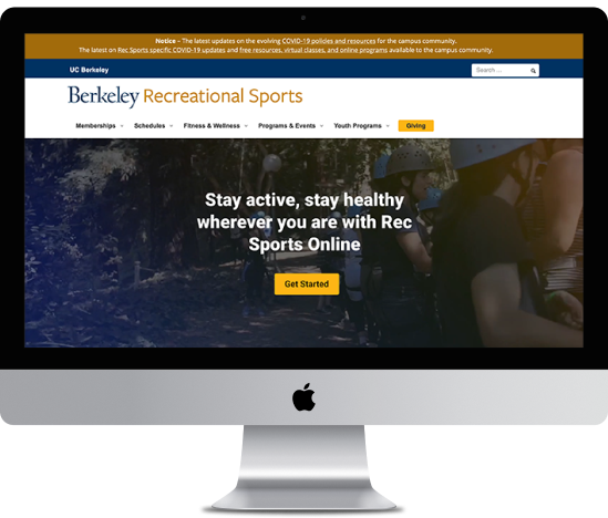
UC Berkeley Recreational Sports
Front-end web designer
This is a self-driven user research project conducted in preparation for an overall department rebrand.
I conducted a competitive analysis, referenced university demographic reports, and pulled web analytics. I also planned and executed user testing that included interviews, card sorts, and usability tasks.
Goals
- Identify the current state of the website, focusing on user behavior
- Identify areas of improvement
Setting
- Client: UC Berkeley recreation department
- Target audience: UC Berkeley students
- Product: The client’s informational and static website. Has about 300+ pages hosting information for 10 different program units.
- Tools: Google Analytics, Google Search Console, Miro, Google Data Studio
Execution
- Desk research
- Competitive analysis
- University demographic reports
- Web analytics
- User testing (6 participants)
- Warm-up interview
- Card sort
- Usability tasks
- Post-exercise interview
Competitive Analysis
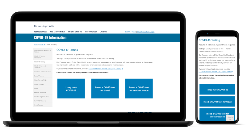
I wanted to know how other recreation entities leveraged their homepage and how their navigation was organized. I looked at 14 higher recreation institutions, including 8 higher-education recreation departments, three public gyms, and three local city recreation departments.
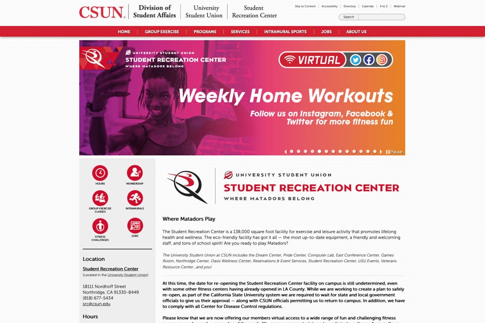
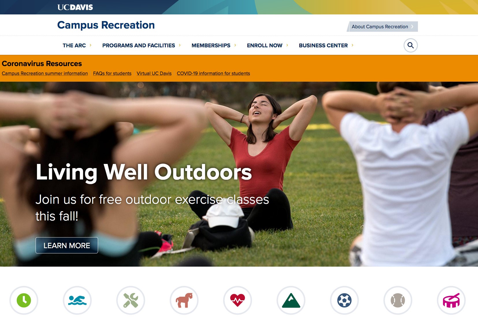
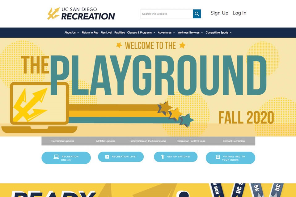
I found that most compelling competitors used their homepage to provide an overview of their offerings and guide students to an offering that fits their needs.
I found that the client’s navigation was very similar to its competitors. This could be interpreted as either we can let this be and devote attention elsewhere or we can make refinements to ensure its navigation is most valuable to their users.
Data Reports
Enrollment reports published by the university informed my decision to focus on Google Analytics data from the demographic age groups 18-24 and 25-34. My primary focus was on 18-24, as it most closely represented the undergraduate population which makes up almost 80% of the student body.
Google Analytics & Search Console
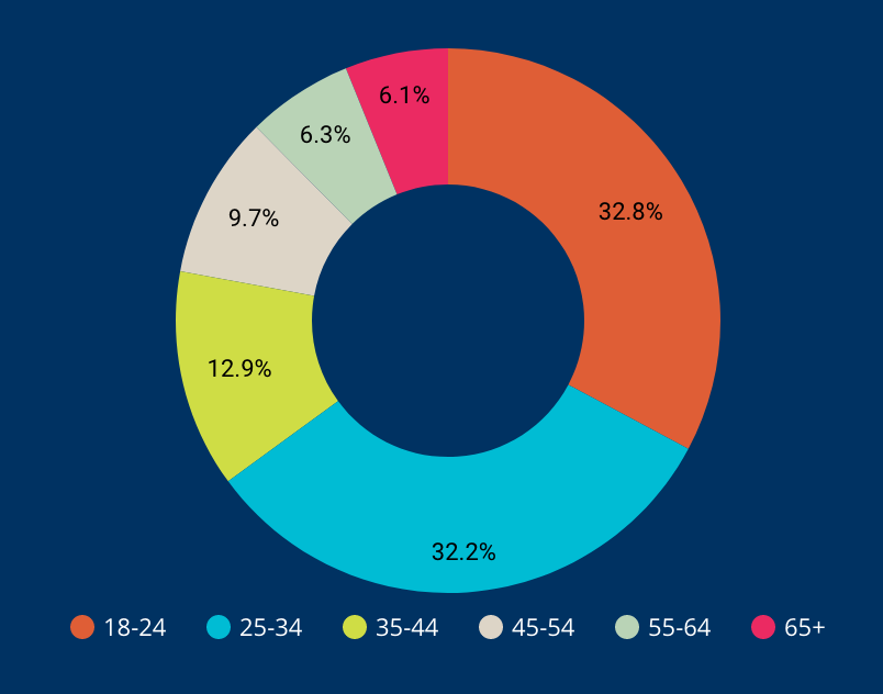
I wanted to challenge the assumption that the site's users are representative of the target audience. I found that most site visitors are older than the average undergraduate student.
I confirmed that most visitors were coming from an organic search, which reinforces the importance of SEO.
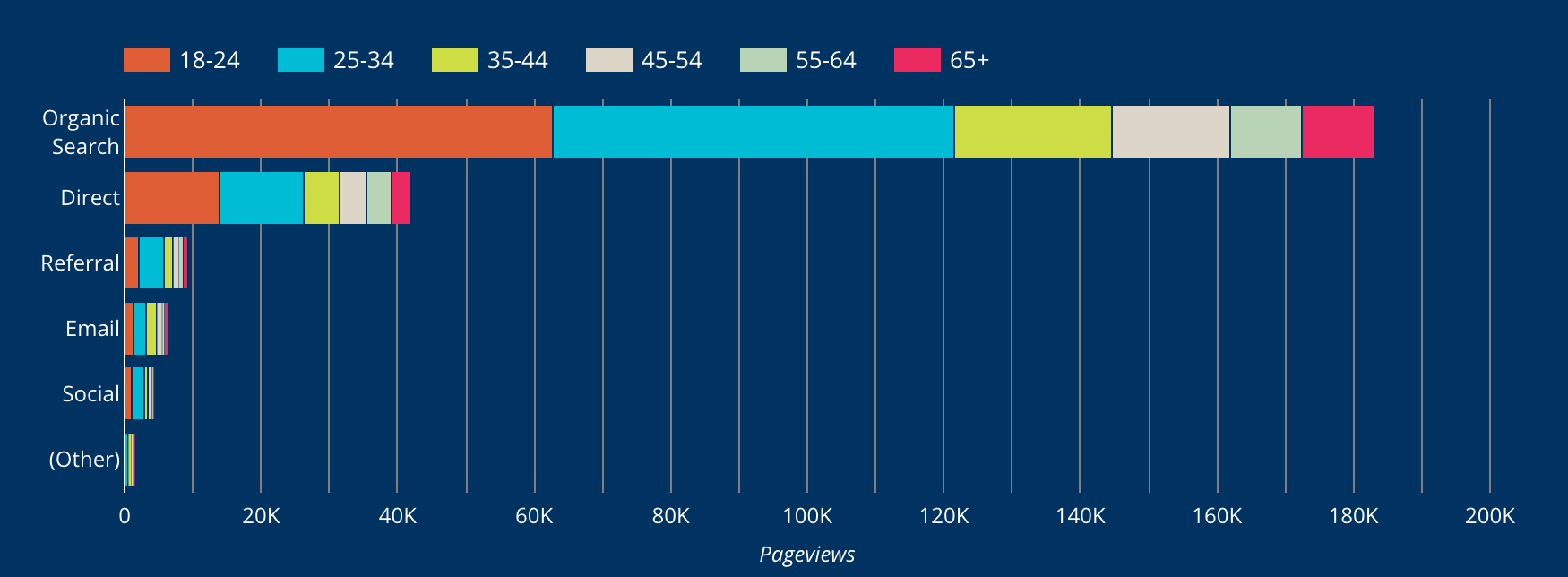
I identified popular pages or areas of the site and identified some subtle differences between the age groups provided by Google Analytics.
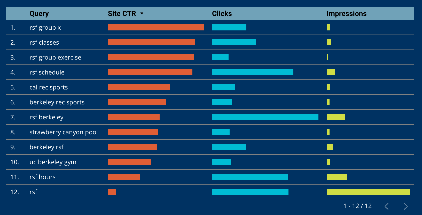
Using Google Search Console Data, I confirmed that content writers should leverage terms like “UC Berkeley”, “Berkeley”, and “RSF” (an acronym for the main fitness facility).
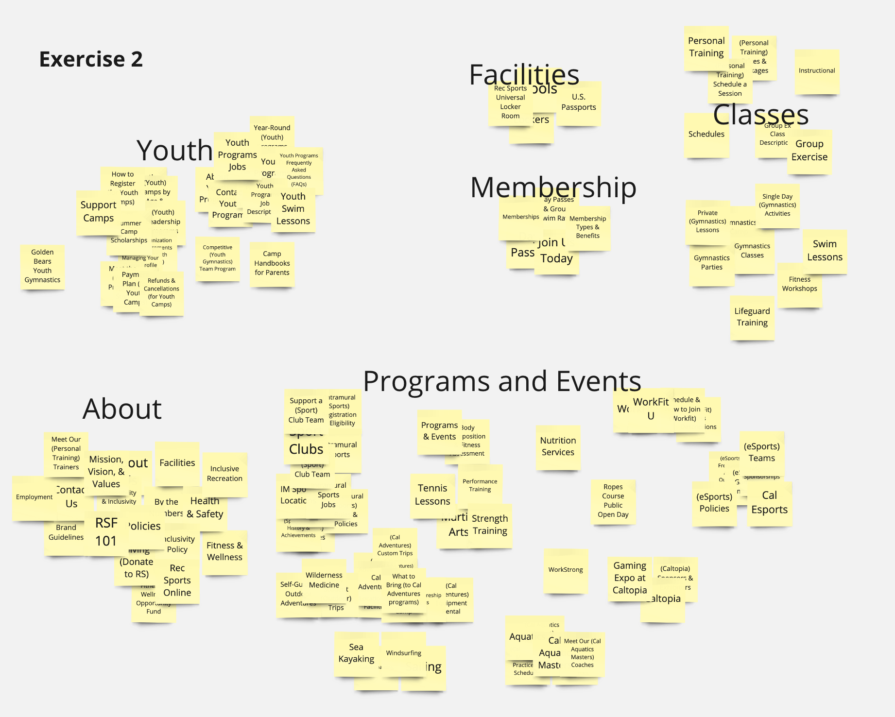
Card Sort
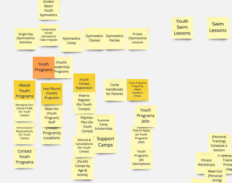
I wanted to compare the existing navigation to a user’s mental model and test a user’s interpretation of terms found on the site.
I identified some groupings that were coming across all users and found that they were mostly keyword-based.
Usability Tests
I asked each user to complete seven tasks based on the popular pages identified in Google Analytics to assess how straightforward it is to reach those pages.
This activity further reinforced the importance of SEO because all participants began each task using a search engine.
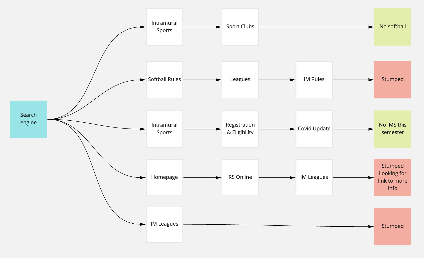
These exercises revealed that there is some work to do in terms of matching page content to page title. On average the students visited 1.9 pages before deciding they completed the task or considered themselves stumped. Of the seven tasks, there were only two where they landed on the “correct” page, where the department intentionally publishes that information.
Post-interview
At the end of the session, I asked the students to reflect on their experience with the homepage and the site’s ease of use. I found that they did not find the information on the homepage useful or worth it to click on. The site’s ease of use received primarily neutral, but varied reviews.
Conclusion
Through this research, I accomplished my goals to identify the current state of the website and identify some areas for improvement. The key takeaways are:
- Audit the content and invest in an SEO strategy. Website analytics and usability tests show searchability is crucial. Card sorts revealed some terms are not easily understood.
- Explore why most people visiting the site are older than the target demographic. This could be an awareness or preference issue.
- Identify next steps for highly-trafficked pages. Should we refine them or work on less-trafficked pages?
- Ideate solutions to better expose students to programs available. Competitive analysis and user testing showed the site is poorly curated.
Reflections
This was a great exercise executing a user research plan in a real-world scenario from end to end.
What I would have done differently:
- Add a round of usability testing to assess the product before the card sort
- Work with a partner to record notes
