UC Berkeley Migration
- front-end design
- content inventory
- project management
UC Berkeley
Front-end web designer

The project is a website migration of a large website, about 400+ pages, to a new template. I ran a page audit, moved and formatted content, oversaw student assistants, collaborated with back-end developers, and curated photos.
Opportunity
The division is moving towards a single template for the website. This site needed to be transferred from its current template to the new template to comply. This project is one part of a larger unit effort to move around 26 different department websites to one unified template.
Goals
- Move the site over to the new template
- Make refinements to improve SEO, maintenance scalability
- Update photos
- Remove outdated pages and posts
- Reduce reliance on 3rd party support
- Match other campus template
Setting
- Users: UC Berkeley staff, students, and surrounding community
- Product: An informational and static public-facing website
- Roles: Front-end web point of contact, project manager for students, designer (choosing photos & content layout)
- In collaboration with: project manager, writer, back-end developers, photographers, students supporting each discipline
- Tools: WordPress, Asana, Google Sheets, InDesign, LucidPress
Results
Content Inventory and Refinement
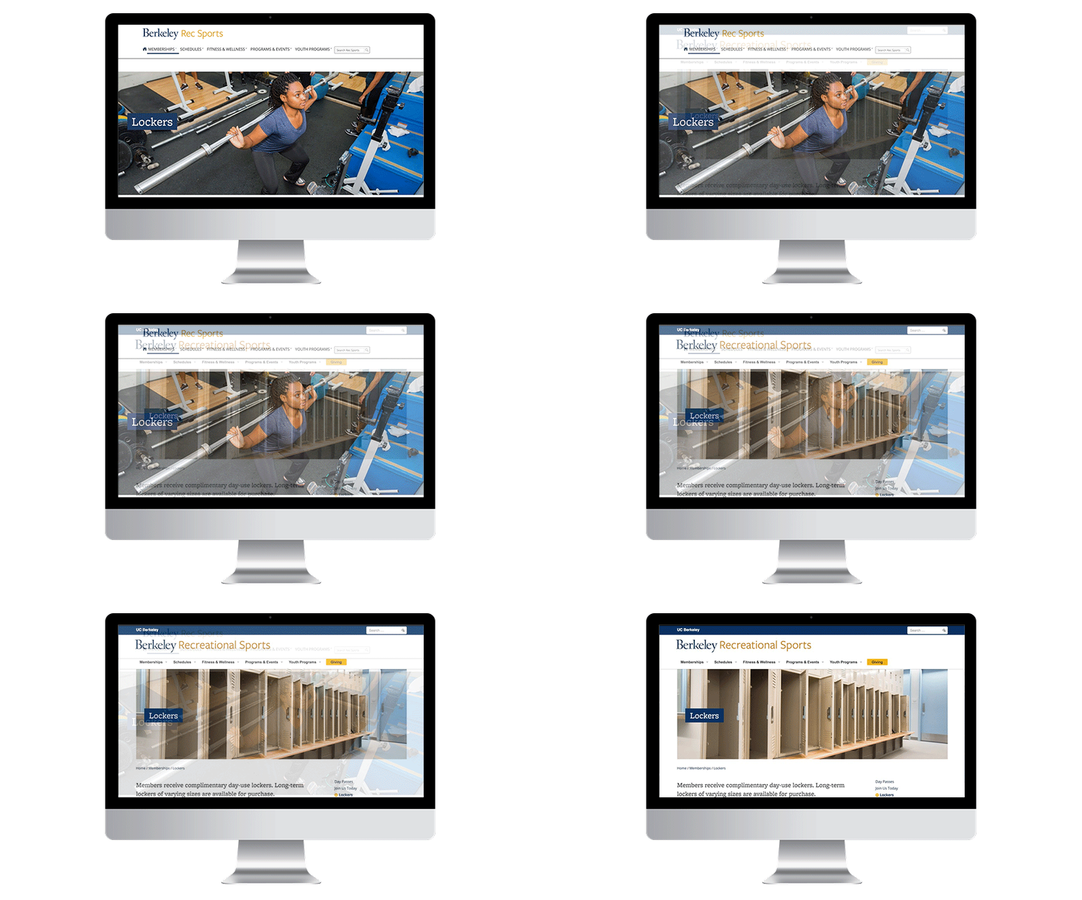
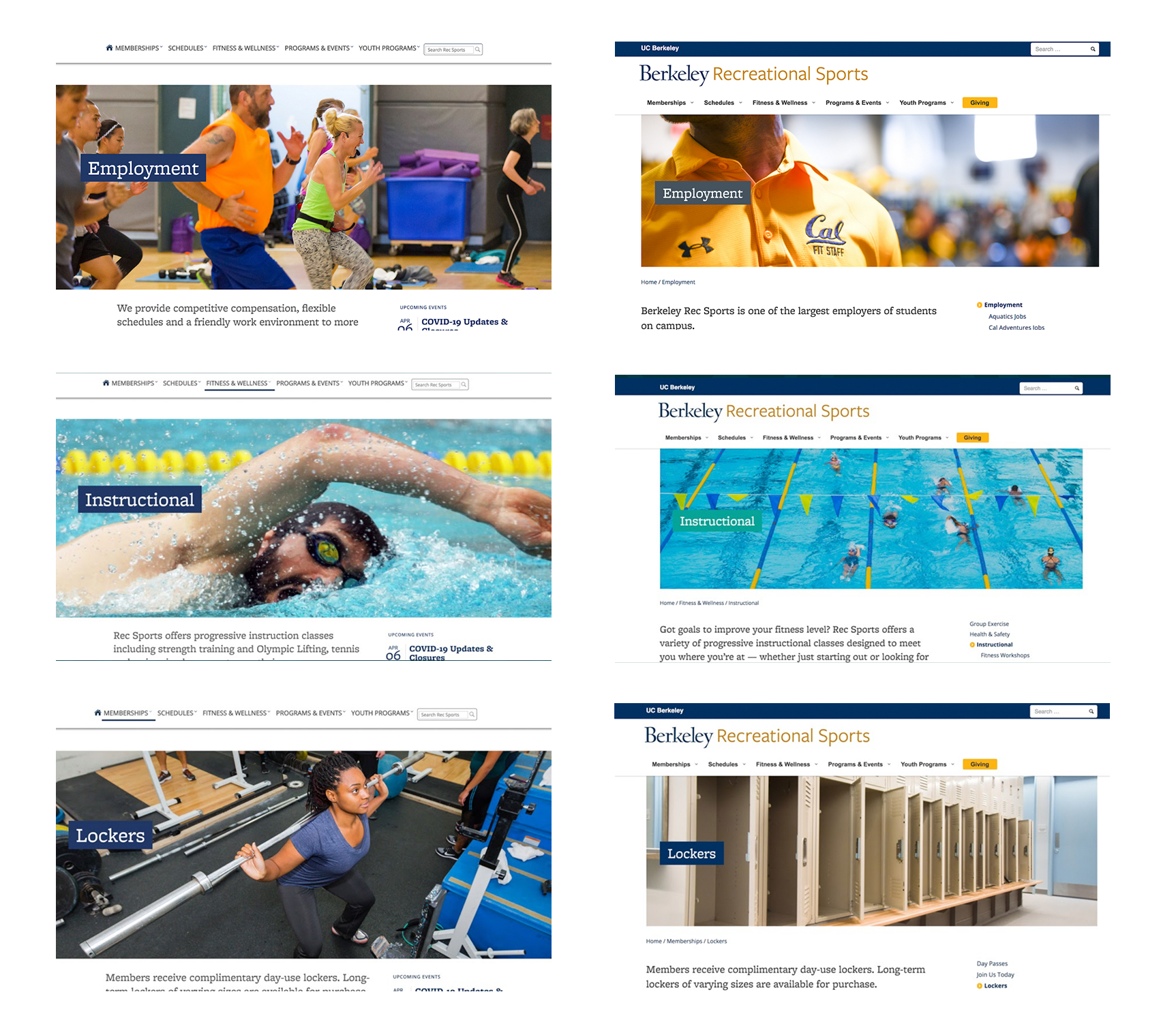
Pages were inventoried, culled (removed about one third), and the remaining content was migrated to the new campus template. The new template brought a cohesive design language and improved content editor capabilities.
Updated Photos

This was an application of an ongoing project I was working on to refresh the photo repository for the client that included a thorough inventory, reorganization, and identification of needs which were executed by my coworkers and our student photographers.
Refined Sidebar Function
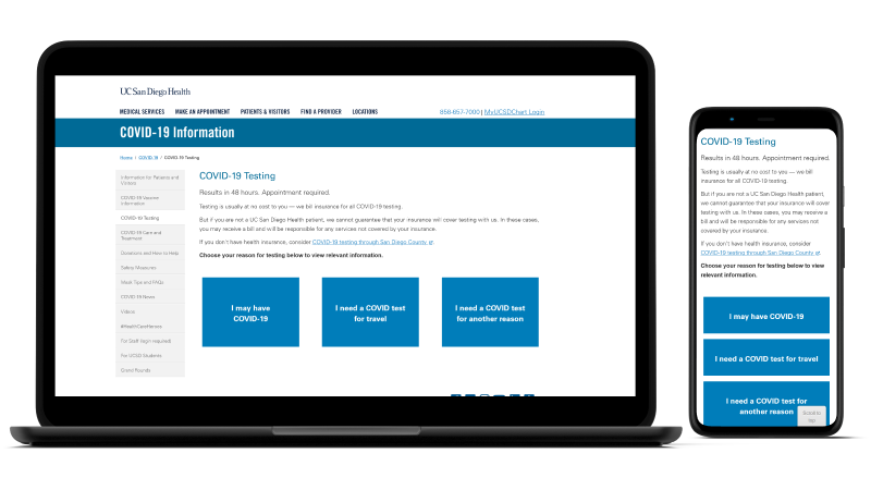
The site’s page volume overwhelmed the template’s default display, so the back-end web development team and I collaborated on a solution to limit how much of the site hierarchy was on a page.
Corrected HTML
The old HTML did not follow best practices, so cleaned it up. For example, the old site skipped heading levels for the sake of styling.
Improved SiteImprove Performance
SiteImprove is one way the UC system measures success for its websites. It evaluates our sites through SEO, accessibility, and quality assurance.


Reflections
This project was an incredible experience working on a long-term and interdisciplinary project where I was able to refine my leadership, collaboration, and organizational skills.
If I could expand the scope of the project, I would like to refine the information architecture by:
- Collaborating with the partner to identify their priorities for their online presence.
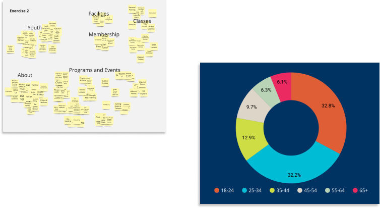
- Assessing the campus community’s perception and relationship to the department using surveys.
- Proposing alternative sitemaps that have been vetted through user testing.
- Identifying visitor trends using Google Analytics.

