Covid Testing
- user experience design
- usability testing
- project management
UC San Diego Health
User Experience Designer
UC San Diego Health asked to re-evaluate the COVID-19 testing program content on their websites.
I led an end-to-end user experience design process involving user research, design, and testing leading to fewer reports of inaccurate registrations and a more user-centered content layout.
Opportunities
- Customers are registering for a different test than the one they need.
- The program has become more complex and the page is expected to provide information for many different audiences.
Goal
Help users efficiently sign up for the COVID-19 testing solution that meets their needs.
Setting
- Users: People in San Diego who need a covid test for travel or other reasons, who are willing to pay out of pocket
- Product: An informational and static public-facing website that funnels to a registration system.
- Methods: personas, user journeys, customer feedback data, usability testing, contextual data gathering
- Tools: Figma, FullStory, Google Analytics, Miro, Maze, TryMyUI, PlaybookUX
Process
Phase 1
The primary goal of this phase was to concisely communicate the differences between tests before registration.
- Inventoried COVID-19 testing content across their different pages.
- Created mock-ups and presented them to the team.
- Implemented phase 1 changes after review.
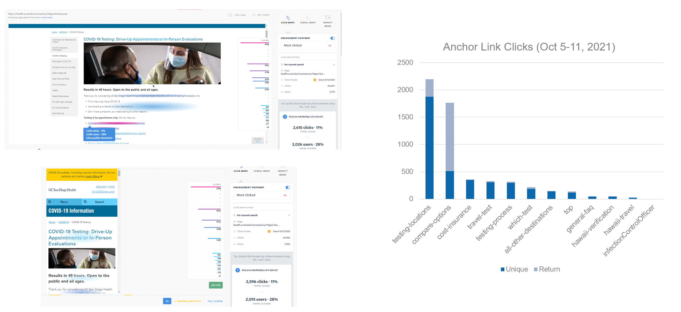
- Monitored via Full Story and made small refinements.
Phase 2
Changes to operations initiated phase 2. The main goal was to incorporate those changes and assess the pain points of the last phase.
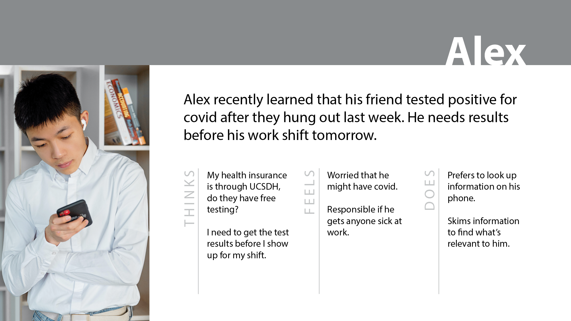
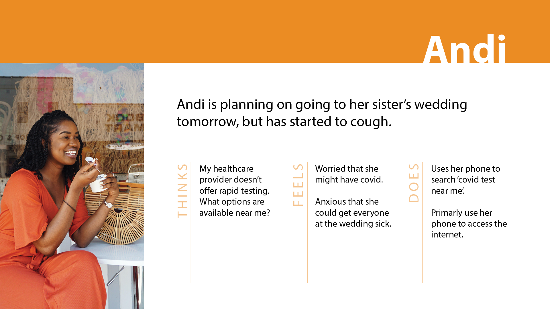
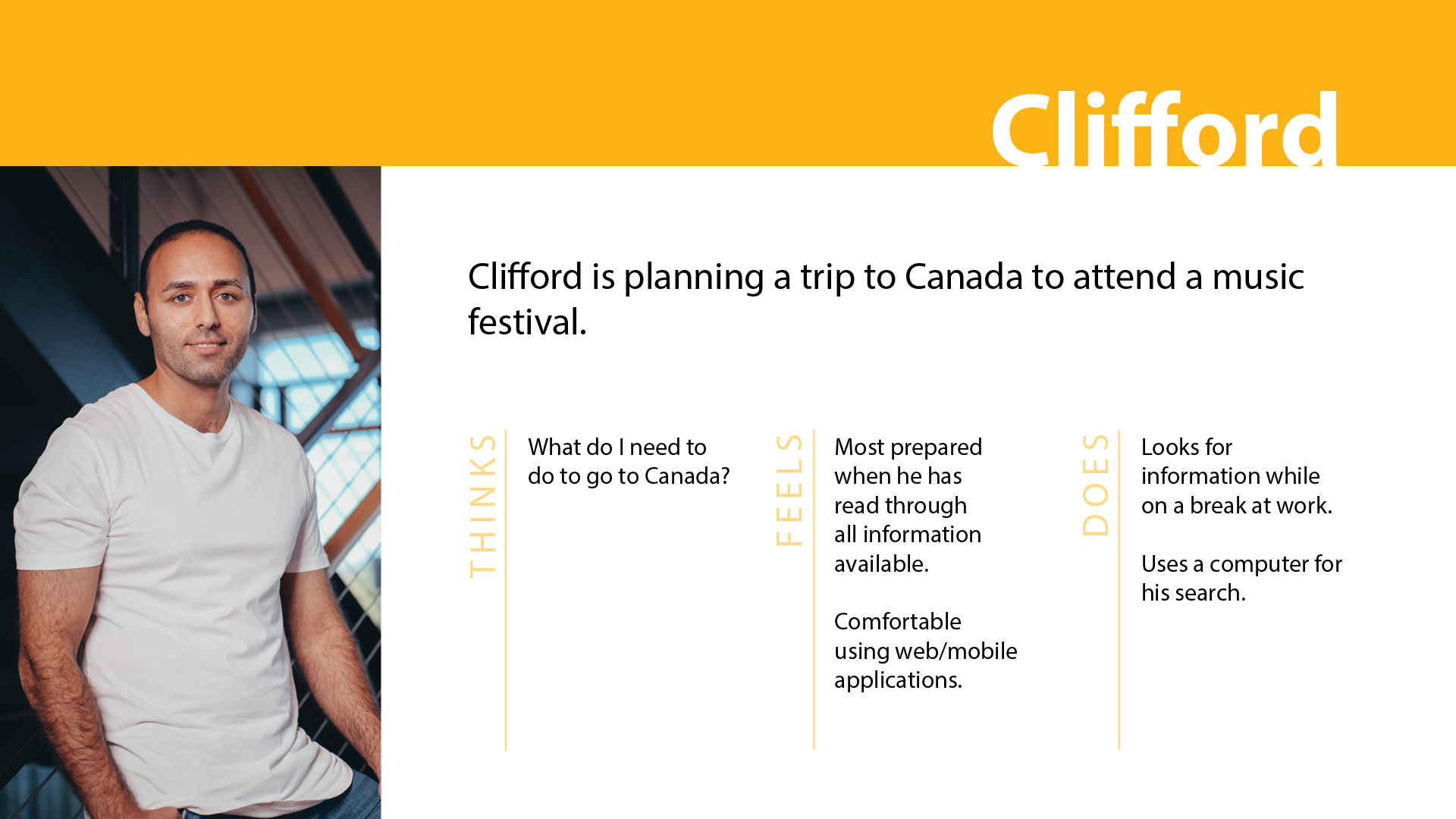
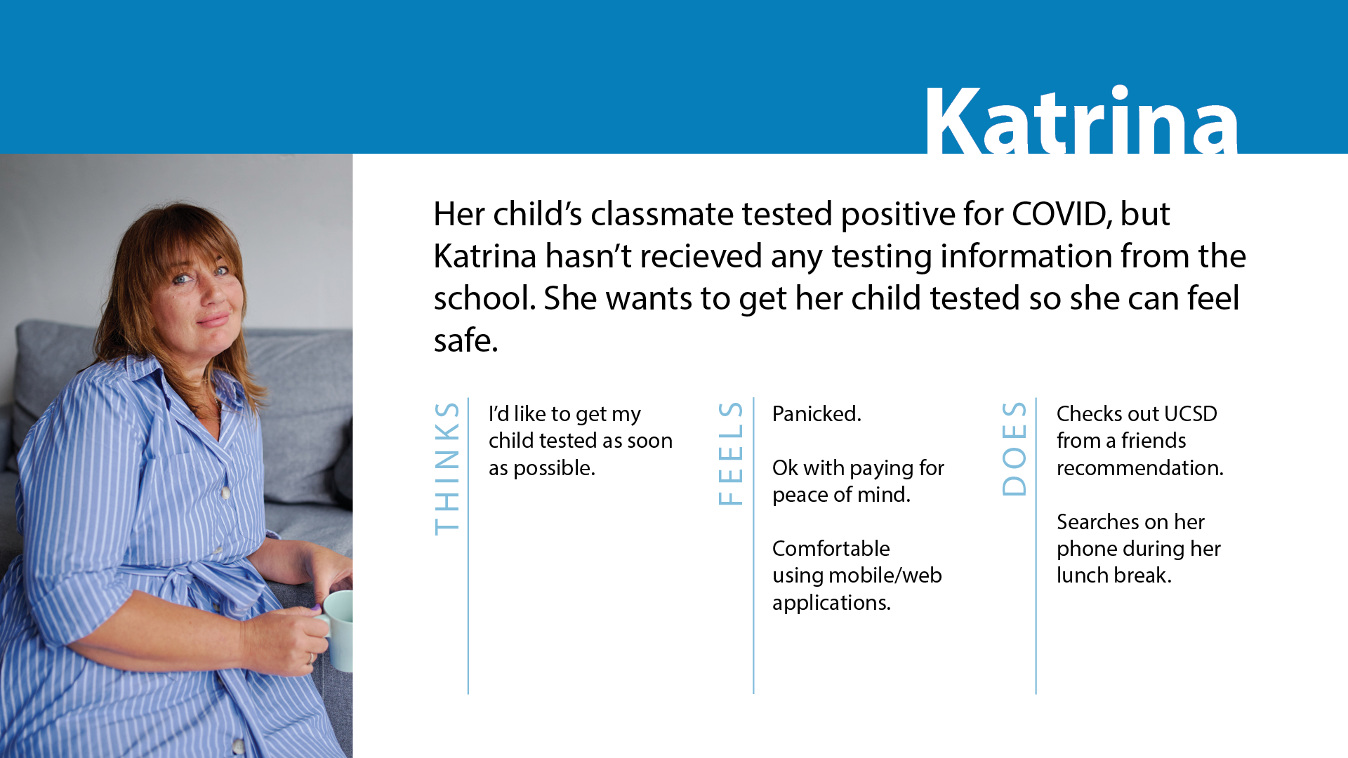
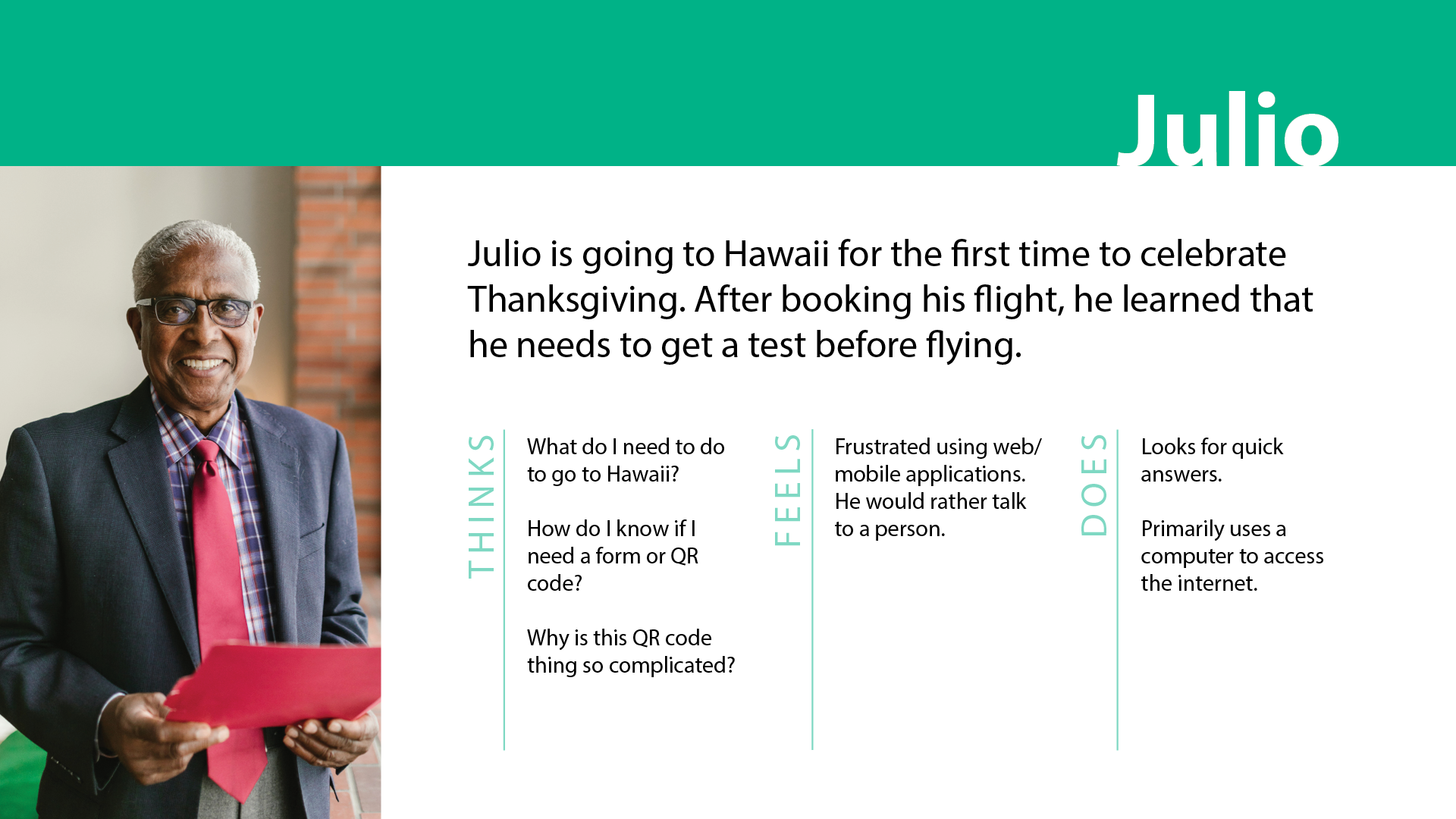
- Created personas.
- Identified pain points via user journeys, customer feedback data from adjacent programs, and a few usability testing sessions.
- Contacted parties involved in marketing and operations to gain additional context.
- Observed page utilization via Full Story and Google Analytics.
- In collaboration with content writers, provided a prototype that incorporated recommendations.
- Proposed roadmap for the rest of the project.
Phase 3
This is the validation and build stage.
- Collaborated with the content team to incorporate revised information due to operational changes.
- Conducted unmoderated usability tests of mobile and desktop views using TryMyUI and PlaybookUX.
- Incorporated findings from usability tests into final development.
- Handed off to the developer and worked closely with them throughout quality assurance testing.
- Published and monitored using FullStory.
Results
- Add function to allow users to filter information relevant to them.
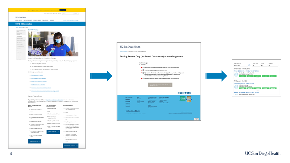
- Added acknowledgment pages to introduce intentional friction. Anecdotes from the operational team showed it was effective in ensuring users knew which test they signed up for.
- Consolidated 5 pages of content across 2 different sites (different audiences) onto one page.
- Reformatted content and added a comparison chart to make pages more scannable.
- Further content refinement and reorganization.
